an eXplainability library for global and regional effects

The following tutorial can be found in effector’s documentation. The jupyter notebook behind the tutorial can be found here.
Global and regional effects offer a straightforward way to explain any black-box machine learning model trained on tabular data. They have two key advantages:
- they provide explanations that easily understood, even by non-experts
- they summarize the model’s overall behavior in a single explanation.
The second point is crucial; global and regional effects explain the model universally. In contrast, local methods provide one explanation per prediction, which allows to understand how a model arrived at a specific prediction, but not how the model works as a whole.
Problem set-up
✅ Let’s consider a neural network trained to predict hourly bike rentals based on historical data.
The dataset is called bike-sharing and contains the hourly count of rental bikes between years 2011 and 2012 in Capital bikeshare system with the corresponding weather and seasonal information. You can find more information here.
The dataset contains several key features, including:
- hour: The hour of the day ⏰
- weekday: Whether it’s a weekday or weekend 📅
- working day: Whether it’s a working day 💼
- temperature: The temperature in Celsius 🌡️
- humidity: The humidity level 💧
- windspeed: The wind speed 🌬️
🚴The target variable is bike rentals, with an average of 189 rentals per hour and a standard deviation of 181 rentals.
🚀 We trained a fully connected neural network for 20 epochs. The model’s average prediction error is around 43 bikes, which is quite good. Now, we want to dive deeper and understand how it makes these predictions.
Explaining Bike Rental predictions
Global effects explain how each feature impacts the model’s output. There are several global effect methods, each with its own set of advantages and limitations. Effector implements five of them:
- Partial Dependence Plot (PDP)
- Accumulated Local Effects (ALE)
- Robust and Heterogeneity-aware ALE (RHALE)
- Derivative PDP (d-PDP)
- SHAP Dependence Plot (SHAP-DP)
The API is very simple. Below, see how to get a PDP plot. You can obtain a similar plot using any other method; simply replace “PDP” with the name of the desired method:
# X = … (the training data)
# predict = … (the prediction function of the black box model)
effector.PDP(X, predict).plot(feature=<feature index>)
Global Effects
Let’s get back to our experiment and visualize the global effects of some features:
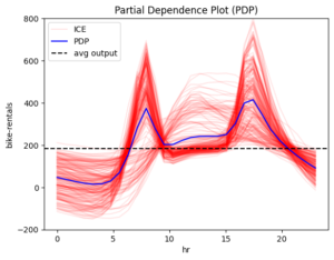
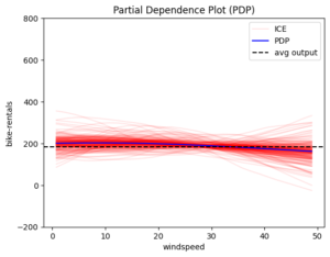
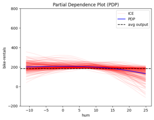
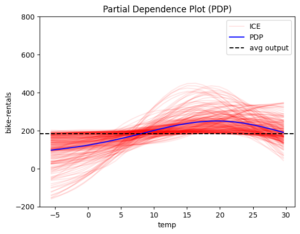
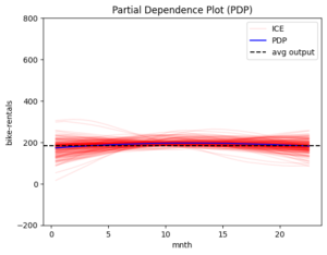

Figure 1 The global effect of features: hour, windspeed, humidity, temperature and month
The blue line is the global effect and explains the average impact of each feature on the model’s output. The red lines represent individual effects, showing how each instance of the dataset behaves as we vary the feature value. These red lines highlight the amount of heterogeneity, or how much individual instances differ from the average effect.
From the plots, it appears that “hour” is the most important feature. The plot varies significantly, therefore the hour of the day is crucial for predicting bike rentals. So, let’s focus on it.
Feature hour
First, let’s check if the other global effect methods produce similar results. This is a common validation step to increase confidence in the explanation. Effector’s consistent API makes these comparisons easy:
feature = 3 # index of feature temperature
# methods share a common API
effector.PDP(data, predict).plot(feature)
effector.ShapDP(data, predict).plot(feature)
effector.RHALE(data, predict, jacobian).plot(feature)
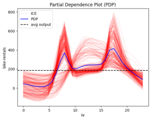
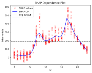
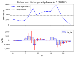
Figure 2 Global effect of feature hour using methods: PDP, ShapDP, RHALE.
PDP, SHAP-DP, and RHALE align. If they didn’t, we would need to investigate the cause of the discrepancies. But in this case, we’re in luck!
📌 Key Observations:
- 0–6 AM: Low and steady rentals
- 6–8:30 AM: Rapid increase
- 8:30–9:30 AM: Sudden drop
- 9:30 AM–3 PM: Small increase
- 3–5 PM: Large increase (evening peak)
- 5–7 PM: Gradual decrease
- 7 PM–Midnight: Steady decline
📌 Interpretation:
Bike rentals are primarily driven by commuting between work and home. There is a sharp increase at 8:00 AM as the workday begins, followed by another peak at 5:00 PM when people head home.
Some Criticism of Global Effects
When analyzing global effects, we must consider whether they truly represent all cases. A key question to ask is: The above interpretation makes sense for working days, so what happens on weekends?
Heterogeneity helps us identify deviations. Take a moment to check the red color in the plots above — what does it show?
📌 Red ICE curves in PDP, red bars in RHALE plots, and red SHAP values in SHAP-DP all suggest high heterogeneity.
In PDP and SHAP-DP, beyond measuring heterogeneity (as shown by the red bars in RHALE), we can also spot distinct patterns:
- Pattern 1: Rapid increase from 6–8 AM and 3–5 PM, with a dip in between (dominant pattern).
- Pattern 2: Rentals rise at 9 AM, peak at 12 PM, and decline by 6 PM (minority pattern).
What might be causing this? You may already have a thought, but let’s explore what regional effects reveal.
Regional Effects
When global effects have a high heterogeneity, regional analysis can help in reducing it. Instead of averaging over all instances, regional effects create a separate feature effect plots for each subregion.
Regional Effect Analysis to feature “hour”
The first step in analyzing regional effects is to use the .summary() method. This prints the identified subregions and the reduction in heterogeneity they achieve.
r_pdp = effector.RegionalPDP(X, model)
r_pdp.summary(feature=3)
Output:
Feature 3 – Full partition tree:
🌳 Full Tree Structure:
───────────────────────
hr 🔹 [id: 0 | heter: 0.43 | inst: 3476 | w: 1.00]
workingday = 0.00 🔹 [id: 1 | heter: 0.36 | inst: 1129 | w: 0.32]
temp ≤ 6.50 🔹 [id: 3 | heter: 0.17 | inst: 568 | w: 0.16]
temp > 6.50 🔹 [id: 4 | heter: 0.21 | inst: 561 | w: 0.16]
workingday ≠ 0.00 🔹 [id: 2 | heter: 0.28 | inst: 2347 | w: 0.68]
temp ≤ 6.50 🔹 [id: 5 | heter: 0.19 | inst: 953 | w: 0.27]
temp > 6.50 🔹 [id: 6 | heter: 0.20 | inst: 1394 | w: 0.40]
————————————————–
Feature 3 – Statistics per tree level:
🌳 Tree Summary:
─────────────────
Level 0🔹heter: 0.41
Level 1🔹heter: 0.29 | 🔻0.12 (28.96%)
Level 2🔹heter: 0.18 | 🔻0.11 (36.75%)
📌 Interpretation
As expected, the effect of hour becomes more homogeneous when we split by working day vs. non-working day. This makes sense — the hour of the influences bike rental differently on weekdays and weekends.
Interestingly, PDP reveals another key split: whether the temperature is above 6.5°C. This second-level split distinguishes between very cold and warmer days, further refining our understanding of rental behavior. But what is the regional effect plot inside each subregion?
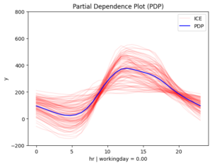
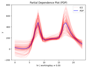
After first-level split
[r_pdp.plot(feature=3, node_idx=i) for i in [1, 2]
After second-level split
[r_pdp.plot(feature=3, node_idx=i) for i in [3, 4, 5, 6]
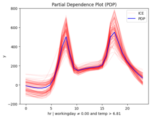
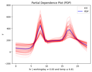
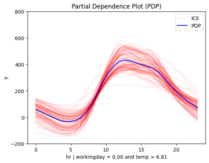
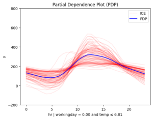
Figure 3. Regional effects on feature hour. From top left to bottom: (a) workingday and smooth temperature (b) workingday and cold temperature (c) non-workingday and smooth temperature (d) non-workingday and cold temperature
📌 Interpretation
The story makes even more sense now!
- 📅 Workdays: Rentals rise at 8:30 AM and 5:00 PM, matching commute times.
- 🌴 Weekends & Holidays: Rentals increase at 9:00 AM, peak at 12:00 PM, and decline around 4:00 PM — a typical leisure pattern.
- 📊 Another Key Factor: Temperature
On non-working days, the effect of hour on bike rentals varies depending on temperature. In contrast, on working days, temperature has less influence, though it still reduces rentals. This makes sense — temperature matters for sightseeing but not as much for commuting.
Key Takeaways
- Global effects provide a broad understanding but can be misleading when patterns vary across data.
- Heterogeneity analysis helps identify when a global effect is insufficient.
- Regional effects refine our understanding by breaking down data into meaningful subgroups.
Effector: Simplifying Model Interpretability for tabular data
Regional effects offer a deeper understanding of an ML model’s behavior, and Effector makes them simple and easy to use. If you work with tabular data, you can get a pretty nice interpretation of what your ML model has learnt in 2–3 lines of code.
Check some more real-world examples:
- Example 1 — Bike Sharing Dataset
- Example 2 — California Housing Dataset
- Example 3 — California Housing Dataset with TabPFN
But that’s not all — Effector comes with several key advantages. It:
- provides a large collection of global and regional effects methods
- has a simple API with smart defaults, but can become flexible if needed
- is model agnostic; it provides methods that can explain any underlying ML model
- integrates easily with popular ML libraries, like Scikit-Learn, Tensorflow, Pytorch or any other
- is fast, for both global and regional methods
Want to learn more? Check out:
📖 [Documentation]
🚀 [GitHub Repo]
📄 [ArXiv Paper]
💙 If you find Effector useful, consider giving us a ⭐ on GitHub! 💙
Effector: Use in AIDAPT
Effector is being developed as part of the AIDAPT European project. It will serve as the primary explainability library for interpreting black-box machine learning models used in four key pilot areas: Health, Robotics, Energy, and Manufacturing. By providing both global and regional explanations, Effector will help stakeholders better understand their data and decision-making processes.
Additionally, Effector will be the foundation for creating surrogate models within hybrid modeling. This includes our work on Regionally Additive Models, which will be also part of the project and will be integrated into Effector’s framework to enhance interpretability and performance.